
The best site for Magic the Gathering collection management, deckbuilding and trading, with one of the most
complete and correct databases of cards.
Since 2008
Use powerful tools to find matching traders based on your collection. Filter & search your collection, build decks with ease. Browse Magic editions, find deck ideas from other users.
-
Collection Manager
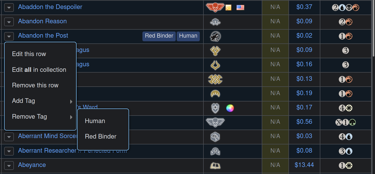
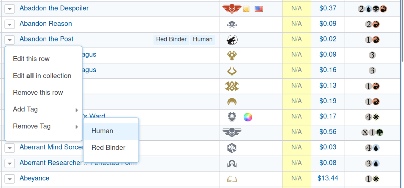
With a smart and responsive user interface for adding cards, you can quickly create an Inventory, Tradelist and Wishlist. Showing your friends what you have for trade is just a link away.
All listings are searchable and filterable so that you can quickly find what edition your foil Black Lotus is from 🙂
-
Magic the Gathering Trading Tools
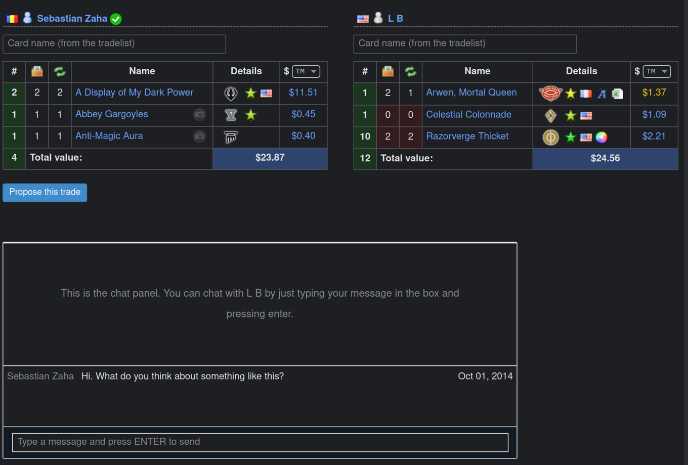
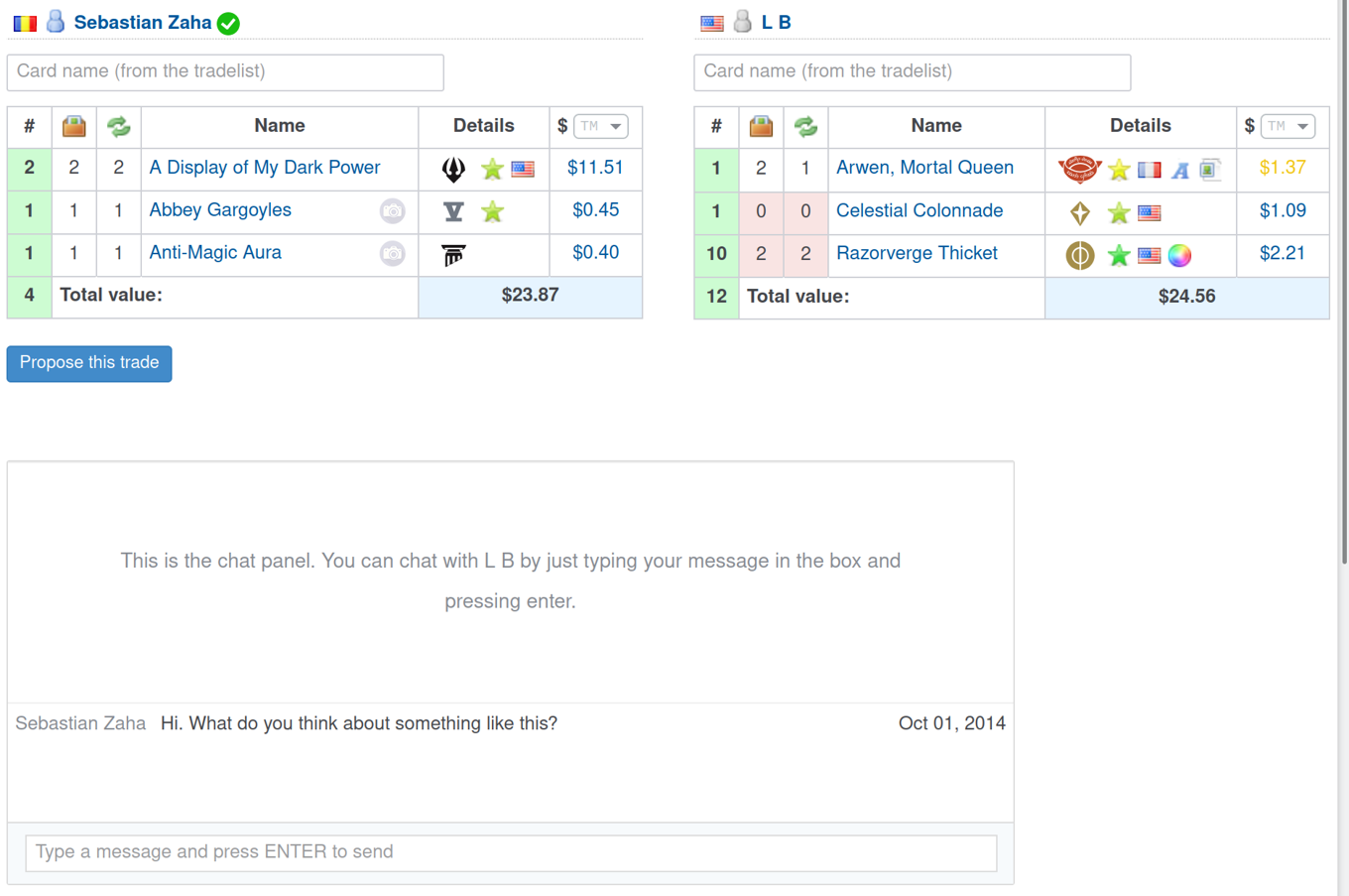
With many people already having collections on deckbox, finding trade partners is a breeze! The website will automatically show you cards you can trade with other users.
We have a built-in interface for defining trades, quick-add inputs, automatic valuing, tracking of sent or received cards, and a strong feedback system to eable easy finding of trustworthy traders.
-
Deck Builder
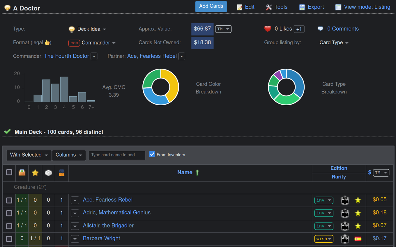
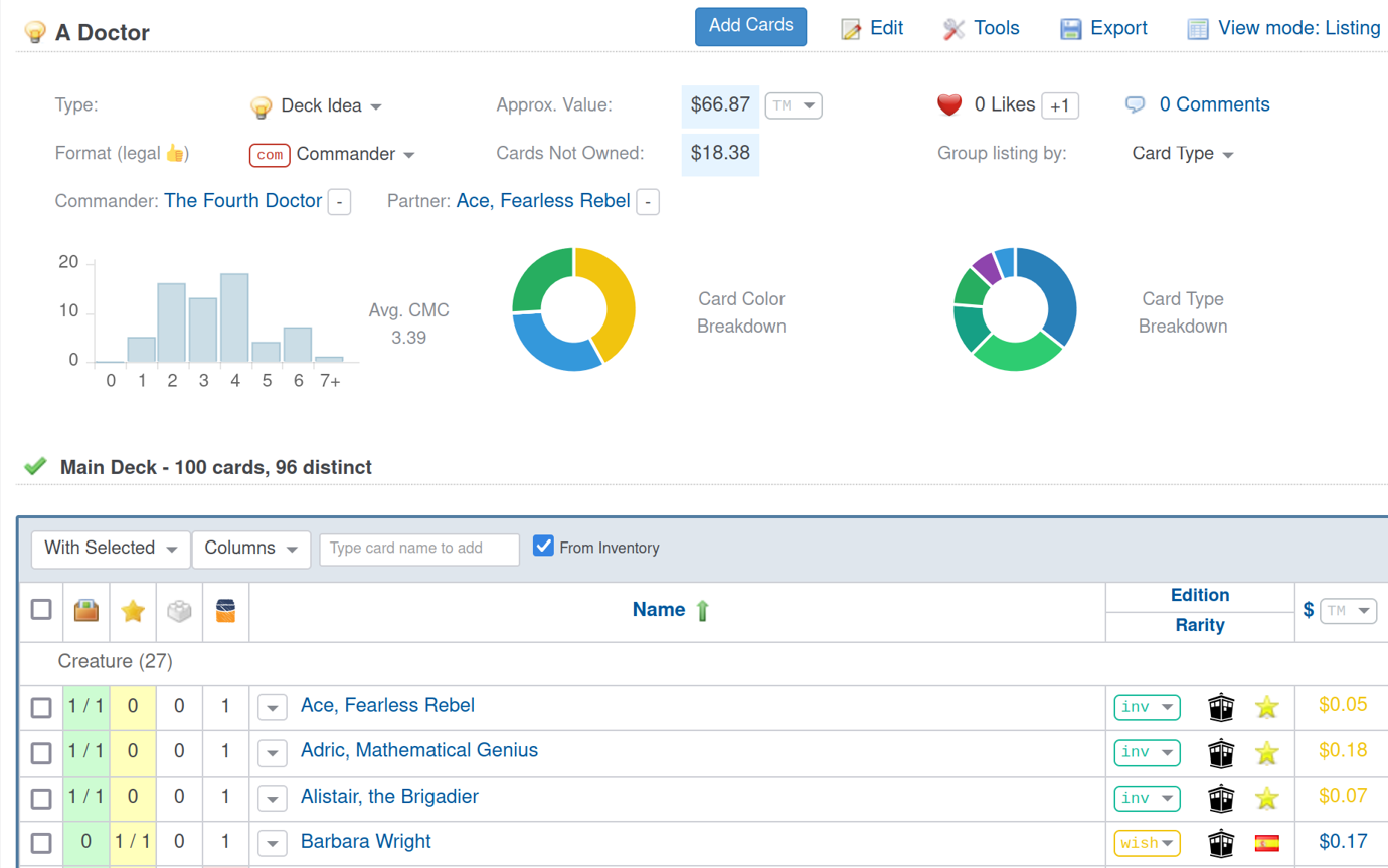
Building decks is as straightforward as collection management. With smart indicators and tools you can see at a glance what cards you are missing for your favorite deck, and then quickly add them to your wishlist.
Analyze deck with tools like mana curve graphs, hand draw simulators. Of course trading card games have a strong social component, so you can comment and rate decks, or find out new building ideas from our forums.
-
Event Organizer
For community managers we offer the possibility to set up event listings, track event attendance and list winning decks. Smart notifications will show all community memebers when someone joins, comments on a deck or event. Members of communities also easily find trading partners in the community, with specialized trade finder tools.
If you are looking for a forum for your community, we provide a subforum as well, free of charge.
We also have many other features to discover!
-
Constantly updated and improved!
Deckbox has been in constant development since 2008.
The site receives constant improvements, the card database is kept up to date, and new features are often added.
418 more announcements in our forum -
Get started with Deckbox Sign up now