
05-May-2014 13:20
(Last edited: 24-Sep-2025 12:59)
31
sebi wrote:gumgodMTG wrote:I understand that you're trying to simplify the look of the individual card pages, but adding more clicks to see the same information seems like poor design to me.
What are you referring to with more clicks?
I mean all of the information was simply presented on the page before. Now to see the same information I have to click on something (usually multiple things).
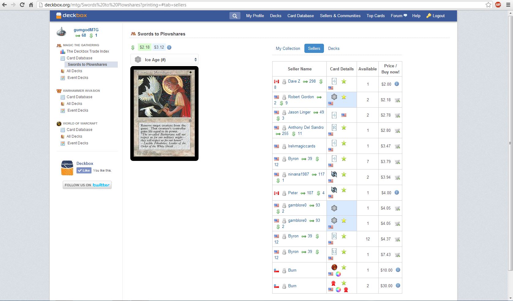
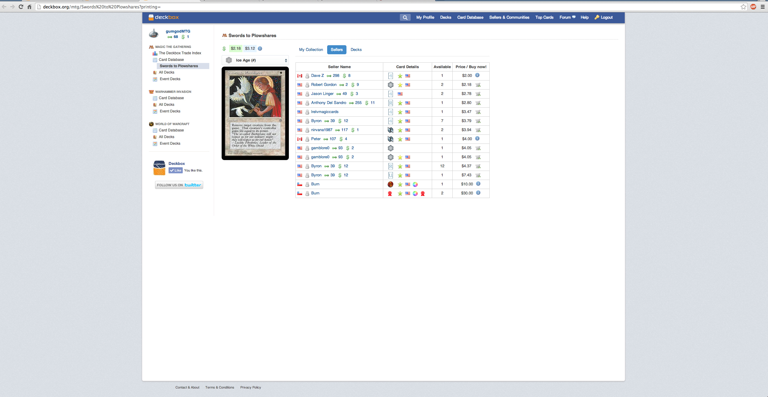
For example if I go to the page for Swords to Plowshares (which the FTV 20 version deckbox market price is wrong on by the way). I'm first shown the information for who has this for sale. To get the information of how many I have from this page and what decks they are in I have to click on something else (My collection). To see other decks that are running this card (which is something I do sometimes do) then I have to click on "Decks". If I want to see which of my decks this card is in I have been clicking decks first, then realizing that's not what I need and clicking "my collection". This is one of those little things where it seems like you are sacrificing the information at a glance in order to adhere to some new cleaner looking design, but for me I'd rather have all the information on one page. Also the list of sellers is now longer because it's spaced differently than it used to be.
I'm also not a big fan of the drop down menu to select a set. Again this is a great design for a mobile phone where space is limited and small things are harder to click on, but for the desktop version I'd like to just see the icons spread out.
I've attached a screenshot because I want you to see the way I see it. To me it looks like a lot of wasted space.


