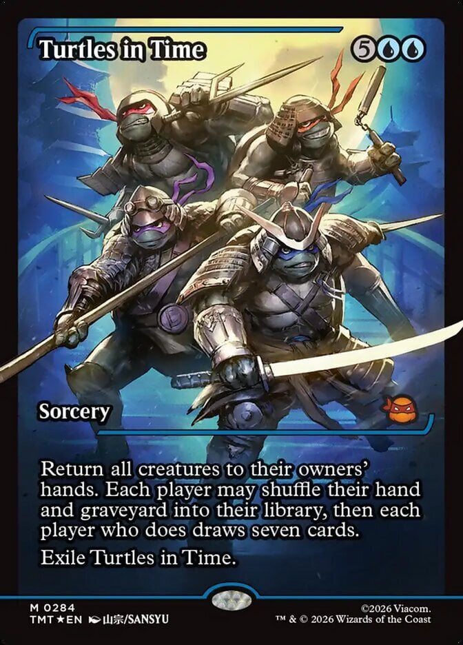
In the section that lists the users who have the card in their wishlist/tradelist/inventory it would be helpful if the dropdown to select those was not close to the next/last links. Many times I move the mouse up to click on next, only to inadvertently go a little to high and automatically open the dropdown instead. Ideally the first/previous/next/last line would be at the bottom of the table and not at the top, so that it is nowhere near the dropdown.
Posts [ 1 to 1 ]
Posts [ 1 to 1 ]

